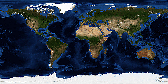
10 Vivid Maps That Show Earth In a New Light
By Bryan Nelson, Mother Nature Network, 5 December 2014.
By Bryan Nelson, Mother Nature Network, 5 December 2014.
Matter of perspective
Global maps have a remarkable ability to put things in perspective. Ever since the Apollo 17 astronauts snapped the famous photo called "Blue Marble," our fragile place in the cosmos has been cast in a new light. Now with more sophisticated satellite imagery, we can view Earth from space in more enlightening ways that expand our understanding of the planet.
Here are 10 vivid maps by NASA that might just change how you look at the world.
Suggested Stories: (1) 8 images of Earth as seen from space; (2) Glowing night-time view of Earth's cities captured by satellite.
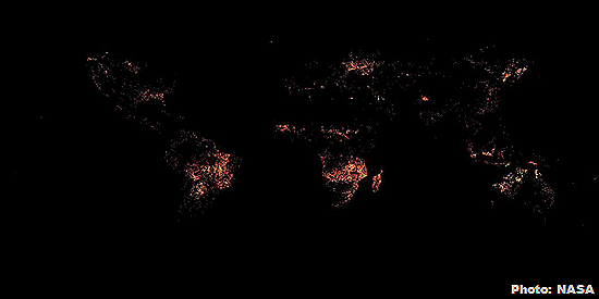
1. Active fires
The data for this map was collected by the moderate resolution imaging spectroradiometer aboard NASA's Terra and Aqua satellites, and it shows the extent of fires across the globe in August 2014. Although many fires are natural (and an important part of the ecosystem), most fires around the world today are caused by humans. Scientists estimate that humans burn an average of 175 million acres of forest and grassland every year, often to make room for agriculture and living space.
In this image, the largest patch of active fires can be seen burning throughout sub-Saharan Africa, mostly because of seasonal savannah land management. You can fiddle with NASA's map widget to see how fire trends shift across the globe depending on the time of year.
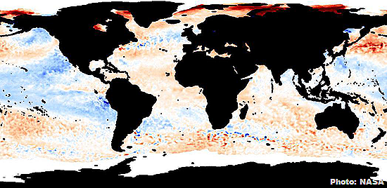
2. Sea surface temperature anomaly
This map shows anomalies in the sea surface temperature in September 2011. (An anomaly is when something differs from the norm.) Dark red areas indicate where recorded temperatures are significantly warmer than they were in the same month in previous years. Frighteningly, the most striking region shown here is in the Arctic, where the effects of global warming are particularly apparent.
This data was collected using sea surface temperature data from the advanced microwave scanning radiometer for EOS (called AMSR-E) aboard NASA’s Aqua satellite.
Suggested Stories: (1) Earth's oceans hit warmest temperatures ever recorded; (2) 7 reasons why Arctic sea ice matters.
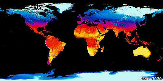
3. Average land surface temperature
This map, assembled by the moderate resolution imaging spectroradiometer instrument aboard NASA’s Terra satellite, shows daytime land surface temperature globally during the month of August 2001. Land surface temperature is a good indicator of the energy balance at Earth’s surface, and these measurements are required for a wide variety of climatic, hydrologic, ecological and biogeochemical studies.
Of particular note in this image is the high temperature of land area around the periphery of the Greenland ice sheet. You can see the dramatic difference in land temperature of exposed land compared with land covered by ice. As the Greenland ice sheet retreats because of global warming, it reflects less sunlight, and more heat is absorbed by the land.
Suggested Stories: (1) 10 of the hottest places on Earth; (2) 2014 will be Earth's hottest year on record.
4. Net primary productivity
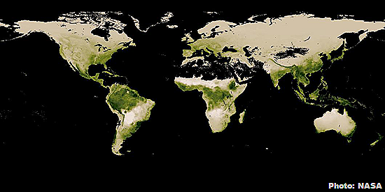
This endlessly fascinating map shows net primary productivity, which is the measure of the difference between how much carbon dioxide plants take in and how much they release. Because it measures change in terrestrial biological productivity, it is probably the single most fundamental measure of "global change" of practical interest to humankind. Basically, this measure keeps track of the habitability of Earth.
This map shows the net primary productivity in the month of July 2014. Of particular note here is the vast importance of the Northern Hemisphere's ring of boreal forest, or taiga, to this carbon cycle.
Suggested Stories: (1) This 90-second video sums up our CO2 problem; (2) Forests flee, dump CO2 as climate warms.
5. Chlorophyll concentration
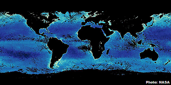
Another important measure of Earth's carbon cycle, as well as ocean health and the health of the ocean food chain, is the chlorophyll concentration of the ocean. Chlorophyll is the green-coloured, light-harvesting pigment found in all photosynthetic plants. Measured here in August 2014 is the concentration of the ocean's phytoplankton biomass, the tiny organisms at the foundation of the entire ocean food chain. Yellow or white areas show the highest concentrations.
This measure is so important to our understanding of the planet's ecosystem that the moderate resolution imaging spectroradiometer instrument aboard NASA's Terra and Aqua satellites take this measure every single day over the entire planet.
Suggested Stories: (1) Stunning emerald green Arabian Sea may herald ecosystem disaster; (2) 7 monuments, cities and world treasures we could lose to rising sea levels.
6. Population density
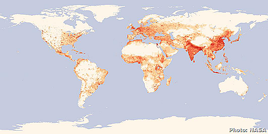
Human population density shows which regions of the world are most strained by human development. It is a key variable for studies of climate change and natural resource consumption and management. This is one map that is not collected via satellite but rather through national population data. It is nevertheless a fascinating factor to consider when looking at other maps: how human population may be driving regional or global trends.
Suggested Stories: (1) NASA photos of cities at night; (2) Google Time-lapse reveals an altered Earth.
7. Albedo
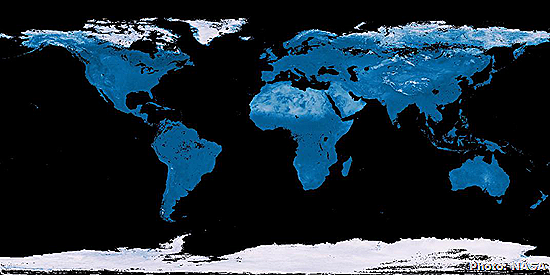
Albedo is the ratio of light that Earth's surface reflects compared with the total sunlight that falls on it. On this map, surfaces that reflect more are represented as being brighter. This is an important measurement for understanding the surface of the Earth as it pertains to climate change feedback loops.
It's interesting to note the reflectivity of Africa's vast Sahara Desert. Desertification is one side effect of climate change, but this may be the case of at least one feedback loop that might help counteract global warming. This map shows measurements from August 2014, based on atmospherically corrected, cloud-cleared reflectance observations from the moderate resolution imaging spectroradiometer sensors on NASA's Aqua and Terra satellites.
Suggested Stories: (1) White paint: A surprising cure for global warming; (2) 10 images of the Earth that look like art.
8. Cirrus reflectance
Cirrus clouds are thin, high-altitude clouds. They can be so thin that they are often invisible to the naked eye, but the moderate resolution imaging spectroradiometer on NASA's Terra and Aqua satellites can capture them with ease. These clouds are particularly important to observe because they play a key role in the greenhouse effect. Cirrus clouds allow most of the sun's light to pass through them, but they also help catch heat rising from the Earth's surface.
Shown here is the cirrus reflectance from September 2014. Bright white pixels in these images are regions completely covered by cirrus clouds. Interestingly, airplane contrails can help form more cirrus clouds than nature would on its own, meaning that this map is also an important way of monitoring human-caused cirrus formation across the globe.
Suggested Stories: (1) Can you name these clouds? (2) Rerouting flights could reduce climate impact of contrails.
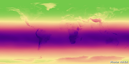
9. UV index
UV rays are the ones that give us sunburn. The purple band in the middle of this map, assembled from data collected in July 2010, shows where rays are most intense. The band falls into the Southern Hemisphere during the winter.
10. Water vapour
Measuring water vapour in the atmosphere is important for studying Earth's water cycle, but it's also a key indicator of climate change. Water vapour traps heat near the surface, keeping our planet warm. Assembled by the moderate resolution imaging spectroradiometer’s precipitable water vapour product, this map shows vapour concentration in August 2014. Darker areas show more water vapour. The monsoon season in Southeast Asia is clearly visible and intense.
Suggested Stories: (1) Earth's water existed 135 million years earlier than scientists originally thought; (2) Satellite photos show Amazon vanishing.


No comments:
Post a Comment
Please adhere to proper blog etiquette when posting your comments. This blog owner will exercise his absolution discretion in allowing or rejecting any comments that are deemed seditious, defamatory, libelous, racist, vulgar, insulting, and other remarks that exhibit similar characteristics. If you insist on using anonymous comments, please write your name or other IDs at the end of your message.