
10 Best Places to Learn About Data Visualization For Your Business
By Merrill Cook, Business Pundit, 31 March 2015.
By Merrill Cook, Business Pundit, 31 March 2015.
Did you know that the human retina can transmit data to the brain at roughly 10 million bits a second (roughly the rate of an Ethernet connection)? That’s a lot of bandwidth, but it doesn’t get effectively used in all of your old school TPS reports. With more and more data created and at the disposal of team members of almost every level, data discovery tools and visualizations are all the rage. That’s not to say all visualizations are good (or even most of them), but a lot of them are. Check out our list of 10 of the sources of inspiration and instruction for business data visualization.
10. Good.is

Good Magazine entered into the infographic game early in the boom around 2006, and by 2008 was named a National Magazine Award finalist for their infographic offerings. Over the years Good has focused on unique research and the presentation of visualization-driven features on social change and quality of life. Nearly all of their larger features are sponsored by large corporations, and have enjoyed great success. They bill themselves out as a “magazine for people who give a damn” and show a unique storytelling angle in data visualization that many corporations can learn from. People like soul, and while slick visualizations tend to attract a lot of attention, your visualization needs to be about topics that matter, too.
9. Jennifer Daniel at Bloomberg

Bloomberg are known for the dashboard visualizations in their terminal, but they also throw some more innovative visualizations out there through Jennifer Daniel (their graphics director). Her visualizations have always struck me as adhering to one of the most important rules of static data visualizations: immediacy. Unless a viewer can really toggle a bunch of switches and play around with the data, you should know the point that you want the data to prove, and put it front and centre. Her graphic about what Americans don’t work is a pretty simple concept, yet shows the employment status of America in a much more clear way than a table ever could. Her (what looks like) subway-map inspired map of our underwater internet cables adheres to the same minimalism, using a few lines of colour and location labels to fully expound on the headline. If you want a lesson in simple, smooth, and crystal-clear design direction, check out more of Daniel’s work.
8. Simon Rogers at the Guardian

While the glut of open data over the last few years has forced journalists to move into the hybrid realm of writer/hacker, a simultaneous shift in marketing has placed the journalist at the centre of what is now considered quality marketable content. In short, journalists can learn from the slick productions of corporations, and corporations can learn from journalists to get quality attention on their brand. For businesses who want to know the short of what this sort of data journalism requires, Simon Rogers, editor of the Guardian’s data blog and data store has written a piece on the basics. He also provides training for individuals, institutions, and corporate clients as seen on his personal site.
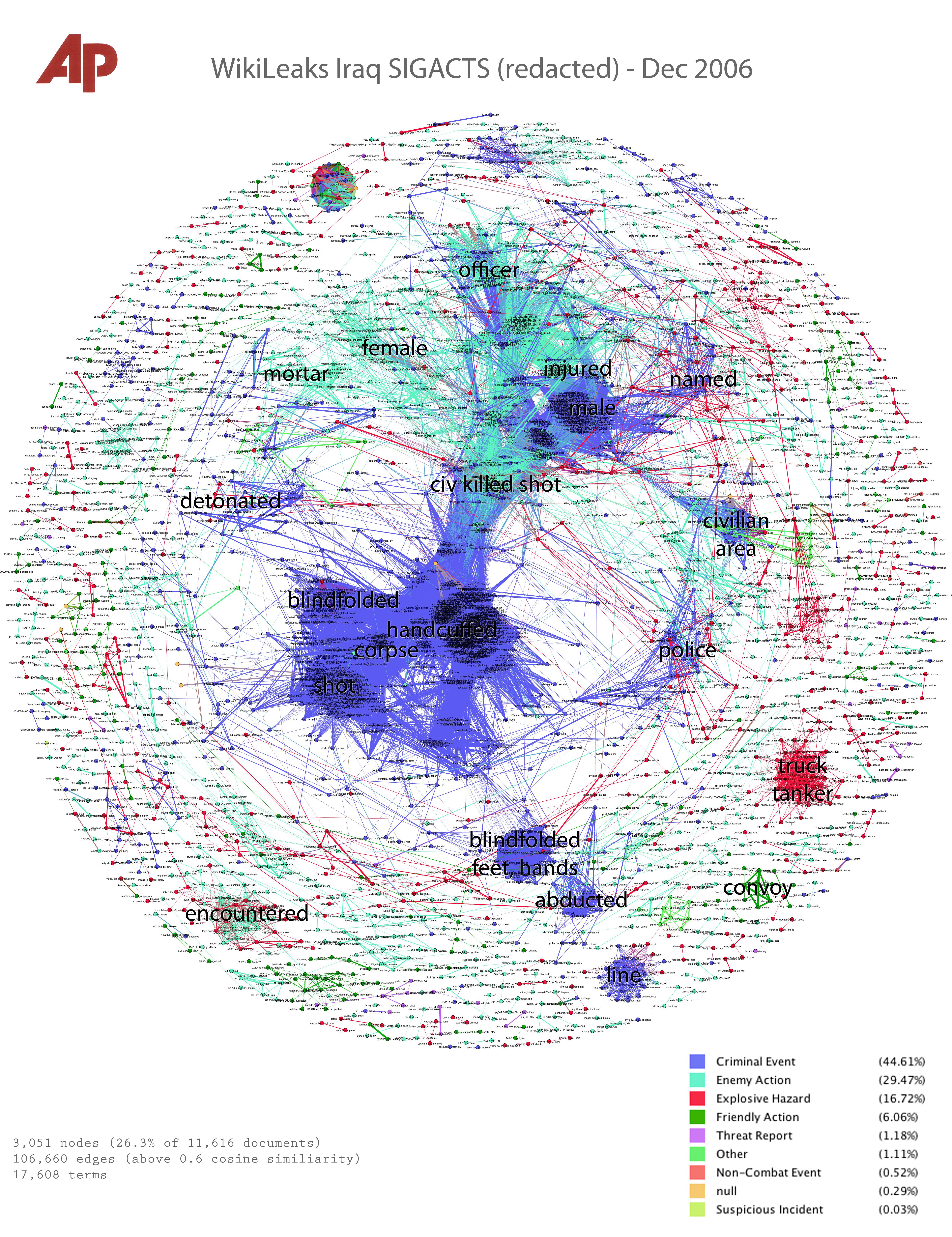
7. Data Journalism at AP

There have been a number of innovative data visualizations presented by the Associated Press, but one of the most interesting is part of their Overview series. Through a set of tools and methods their Overview blog has released, it’s possible to take large sets of documents and map the important words that occur in those documents. The initial idea was to visualize terms from WikiLeaks documents related to 2006 in the Iraq War. The explanation and terms are particularly pertinent to your own data visualizations if you’re dealing with data sets that are much too large to read (as many FOIA request results are). For many data visualizations, your data is only as valuable as the tools you have to access the data with - a topic greatly focused on at the Associated Press Overview blog.
6. Flowing Data

Flowing Data is home to some of the most innovative and thoughtful visualizations online as well as other more educational features like tutorials, discussions on the pros, cons, and techniques that can be used for certain types of data, and so forth. Tutorials (mostly for the data visualization library R) as well as three books on data visualization are also available. For some of the most thoroughly constructed (and beautiful) data visualizations online, and for those that aren’t tied to any one institutions agenda, you’ve got to check out Flowing Data.
5. Nicholas Felton’s Personal Annual Reports

Nicholas Felton was one of the lead designers of Facebook’s timeline, and has since spent a number of years releasing his personal annual reports as well as developing daytum.com. His personal reports may seem trivial for business reporting, but are more an exercise in visualizing data and weaving together of disparate points into a story. The reports record everything from the number of words recorded in all of his communication mediums, to all of the songs he listened to in a year, to walks he took. All placed in innovative fashion into beautiful reports. Daytum.com is built around a similar process but for the users. Felton has created an app that helps users record their own daily data and then plot it on the site.
4. NPR Visuals Team

NPR has been one of the leaders in newsroom data visualizations for years, largely thanks to their talented Visuals Team. Whether you’re looking for entertaining content like their Running Gags on Arrested Development graphic, or visualizations that are good in a serious sense (Live Visualizations from the 2012 Election), NPR has you covered. Their visualization team also makes many of their tools open source, as well as provides tutorials for their use for others who are interested in creating data visualizations.
3. Manuel Lima at Visual Complexity

For what is perhaps the largest collection of truly innovative data visualizations, check out Visual Complexity, a resource space for anyone interested in the visualization of complex systems. While some of the visualizations are a bit more experimental, they’re at the forefront of new visualization types, and at the very least can provide your team with some ideas on how to visualize your data. The site is run by Manuel Lima, a Fellow at the National Society of Arts, and one of Creativity Magazine’s “50 most creative and influential minds of 2009.″ The Visual Complexity Book, titled Visual Complexity: Mapping Patterns of Information is also a great resource for any designer, and features almost 300 of the most innovative representations of networks as well as explanations.
2. Mike Bostock

Mike Bostock is perhaps best known for developing D3.JS, the de facto standard for interactive data visualizations online and for which he has also provided extensive documentation, examples and tutorials. Even if your team is going to use another framework for you visualizations, there’s still plenty of inspiration to be had from the D3 documentation’s example page. Much of Bostock’s more innovative work is shown at New York Times, where he is a graphics editor. Recently he has begun exploring ways in which we can visualize not only our data but the algorithm through which our data is processed as well. With interactivity this enables users to peer into the black box of functions that created the original visualization and see how little alterations to how the data is processed can significantly alter the final visualization. A good example is Bostock’s Renting or Buying interactive graphic.
1. Proctor and Gamble’s Data Rooms

For a business-centred application of data on a large scale, perhaps the best company to learn from is Proctor and Gamble. P&G have not only integrated large data visualization screens into “business sphere” rooms in over 50 locations where managers meet, but have also established a visual language for presenting data, so that decision makers from different branches of the company can talk to one another about what they see. Besides the room-sized wall-mounted data visualization displays, P&G have experts on hand from the Information and Decision Solutions group who can alter the visualizations at a moments notice. On a smaller, yet also visually-compelling and unified scale, P&G also has a “decisions cockpit” data platform online that over 50,000 of their employees has access to. Talk about a well informed workforce.
Top image: An example of data visualization from Gephi, the open graph visualization platform, via Mind-Mapping Blog.
No comments:
Post a Comment
Please adhere to proper blog etiquette when posting your comments. This blog owner will exercise his absolution discretion in allowing or rejecting any comments that are deemed seditious, defamatory, libelous, racist, vulgar, insulting, and other remarks that exhibit similar characteristics. If you insist on using anonymous comments, please write your name or other IDs at the end of your message.