Big gambles, big blunders
You'd be hard-pressed to find a tech company that had a busier year than Microsoft. Besides unveiling new versions of Windows, Windows Phone, and Office, the Redmond giant instituted a sweeping visual overhaul tying together the entire software product line-up. Microsoft also revitalized its cloud strategy (hello, SkyDrive!) and even launched Surface RT, a new take on the tablet category that steals a page from Apple’s we-can-make-better-hardware-than-any-of-our-OEM-partners-can playbook.
Regardless of whether Microsoft remains the most dominant software company in the so-called post-PC era, 2012 will be remembered as the year when Microsoft took its biggest gambles to challenge Apple and Google on mobility. Here's a look at the company’s biggest hits and misses for 2012.
WIN: The Windows desktop is better than ever
The biggest news about Windows 8 may be the system's new touchscreen interface, but the traditional desktop in Windows 8 saw some big improvements, too. New desktop upgrades include a revamped file copy dialog, better printer discovery, improved multiple-monitor support, pooled storage via the new Storage Spaces feature, a new chkdsk, and improved version history. Basic speed and performance have improved as well on the desktop side of Windows 8, and that’s a benefit that any hard-core PC user can appreciate.
FAIL: The new Start Screen antagonizes PC users
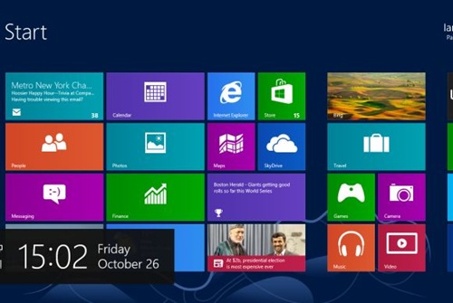
User interface experts - and overwhelming public opinion - have judged the touch-centric Windows 8 Start Screen to be a challenging and even antagonistic interface for PC users working with keyboards and mice. The so-called modern UI is fun and engaging on touchscreen devices, but it requires too much cursor hovering, right-clicking, and all-around “did I do that right?” guessing for people working on traditional PCs.
The modern UI is also poorly integrated with the desktop side of the Windows, and living with the OS day in and day out means struggling with file associations and system settings that are split between the system’s two disparate halves. The nail in the coffin? You can’t boot directly into the Windows 8 desktop. Omitting that option might have been Microsoft’s biggest public relations failure of the year.
FAIL: Buh-bye, Mr. Sinofsky
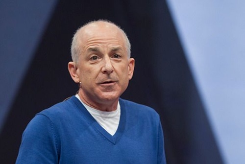
Reports and commentaries following the departure (dismissal? summary execution?) of Steven Sinofsky, suggest that the former president of Microsoft’s Windows Division was shown the door because he was a stubborn political actor who didn’t play nicely with others. The rough sailing prior to the leadership shakeup surely didn't make Microsoft’s greater goal of revamping its product lines into a single, self-contained, borgy expression of Windowsness any easier to achieve. Still, the timing of Sinofsky’s exit was horrible for Microsoft. Windows 8 and Surface RT had just launched to middling reviews when - bam! - out went their main architect. Jettisoning Sinofsky may be a win for Microsoft in the long-run, but its short-term impact was entirely negative for a week’s worth of news cycles.
WIN: Surprise! Outlook.com is actually quite nice
Microsoft had a floundering webmail service in Hotmail, but everything changed when the company reimagined Hotmail as Outlook.com. Beyond adopting a UI that’s consistent with the rest of Microsoft’s “modern” style, Outlook.com introduced a contacts interface that mimics the People app on Windows 8. What’s more, the far right panel in Outlook.com can switch between an instant messaging interface and an area displaying Facebook and Twitter status updates. Outlook.com also provides fast switching between other Microsoft online services, such as SkyDrive and Windows Live Calendar. Outlook.com will have a tough time battling Gmail, but it has all the features it needs to do so.
FAIL: Outlook for Android v.1 is the same old same old
Microsoft gets a thumbs-up for improving email by making so many positive changes in Outlook.com, but Outlook for Android gets a big thumbs-down. Indeed, the Outlook for Android app is little more than the old Hotmail Android app with different colours and a new name. You won't find Microsoft's new modern design language in Outlook for Android, as you will in SkyDrive for Android, and the out-dated menu tabs at the top of the app have got to go.
WIN: Windows Phone 8 makes a fine OS even better
Circumstantial data suggests that the Windows Phone platform has experienced an uptick in user adoption over the past two months, which has to be a relief for Microsoft. Despite a good first effort, Windows Phone 7 never took off, and the future remains uncertain for Windows Phone 8. Nonetheless, Microsoft has put its best foot forward with Windows Phone 8, which offers a fun, eminently functional OS loaded with cool new features, including a customizable lock screen; built-in mobile versions of Office apps; always-on Skype integration; seamless file syncing across the whole Windows ecosystem; and Kids Corner, a feature that cordons off a child-safe area on any parent’s phone.
FAIL: No Windows Phone 7.8 for you!
Many Nokia 900 users were infuriated to learn that their new, state-of-the-art Windows Phone 7 devices would be rendered obsolete less than a year after the operating system’s launch. Microsoft tried to make amends for the fact that WP7 owners couldn't upgrade their devices to Windows Phone 8 by promising an interface overhaul called Windows Phone 7.8. The new upgrade would at least make Windows Phone 7 handsets look as though they had the new OS. But after saying that WP7.8 would arrive in the fall, Microsoft in November pushed the cosmetic update back to 2013, disappointing their unhappy WP7 customers once again.
WIN: Surface RT shows that Microsoft can build compelling mobile hardware
Microsoft’s first stab at designing, engineering, and manufacturing its own mobile gear may be off to a slow start, but the Surface RT is a fine piece of high-end hardware. The tablet offers a compelling alternative in a market that is dominated by Apple's iPads and muddied by a cattle call of “me too” Android devices. The Surface’s industrial design is top-notch, and its integrated kickstand and Type Cover accessory turn a fairly traditional tablet design into a serviceable PC workstation. The tablet’s display can’t touch the new iPad for visual splendour, and its OS is full of fail (see next slide). However, the Surface RT’s build quality and overall differentness speak volumes about Microsoft’s strengths as a fledgling tablet manufacturer.
FAIL: Windows RT just doesn’t deliver
When Microsoft announced in 2011 that it would create a version of Windows for devices running ARM processors, it seemed like a good idea. But Windows RT has turned out to be a vexing mess. Windows RT’s most egregious sin is that it includes a semblance of the traditional desktop OS, but you can’t install any desktop applications on it. As a result, the desktop portion of Win RT just sits there - a barren tundra on which a few lonely Office apps and built-in system functions go about their business in quiet dejection like solitary musk oxen.
The epic fail of Windows RT overshadows a secondary fail: Microsoft never properly explained the differences between Windows RT and Windows 8 to the world at large. This is not how you launch a successful tablet OS in the age of turn-key, easy-enough-for-Grandpa iPads and Kindles.
WIN: SkyDrive continues to impress
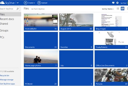
Before Dropbox, Box, Amazon storage, or Google Drive, there was Microsoft'sSkyDrive. But following SkyDrive's launch in 2007, Microsoft promptly ignored it, offering little integration of it with other company services. But that changed in 2012, when Microsoft rolled out Dropbox-style desktop integration for Mac and Windows PCs; mobile apps for Android, iOS, and Windows Phone; a new app for Xbox 360; and even a Web-based, remote-access feature for Windows Vista SP2, Windows 7, and Windows 8 PCs. In short order, SkyDrive has become directly integrated with the entire Microsoft product line, most obviously with Windows 8 and Windows Phone 8. It’s a winning cloud resource, and its rapid rise shows that Microsoft can do many things right.
FAIL: Bing sidebar gets it all wrong
In May, Microsoft came up with a way to integrate social networking with Bing through the Bing social sidebar. The new feature lets you see which of your friends are hip to topics that you’re running searches on, and it also surfaces high-profile experts' tweets that ostensibly relate to your own search queries. But unlike Google's Search Plus Your World (also introduced in 2012), Bing doesn’t try to merge your life with search so much as it tries to insert search into your life. The result is a sidebar that looks nice but has limited utility.
WIN: Microsoft Office boldly steps forward
Microsoft took a big step forward with its preview edition of the upcoming Office 2013. The new productivity suite will, for the first time, allow home users to subscribe to Office for $100 per year via Office 365. Buying a subscription entitles you to download the software on up to five PCs at a time, and even to download temporary versions for one-time use on public PCs. Office also offers SkyDrive online storage integration, so you can access your documents from anywhere. You can still buy boxed versions of Office 2013, but Microsoft hopes that most people will switch to an Office 365 subscription instead.
On top of all that, the revamped user interface is cleaner, more sober, and often easier to use.
FAIL: Metro - never speak its name again
Once upon a time, Microsoft had a name for its new design language, the aesthetic foundation for its pan-product UI: Metro. Microsoft was so proud of the name that the company glorified it on campus wall posters (the shot at left came from the Twitter feed of Microsoft expert Paul Thurrott). But in early August, the company did an about-face. The name Metro was peremptorily dropped, and Microsoft embarked on a tortuous journey to rechristen the new UI. The first advisory: Call it "New User Interface." Catchy! Since then, Microsoft has floated "Windows 8 Style UI," "New Windows UI," and "Modern UI Style" as acceptable synonyms for the look-and-feel formerly known as Metro.
But the public doesn't need a fancy name for the new Microsoft aesthetic. We just need a single term that everyone agrees to use and that has some staying power!


No comments:
Post a Comment
Please adhere to proper blog etiquette when posting your comments. This blog owner will exercise his absolution discretion in allowing or rejecting any comments that are deemed seditious, defamatory, libelous, racist, vulgar, insulting, and other remarks that exhibit similar characteristics. If you insist on using anonymous comments, please write your name or other IDs at the end of your message.