
Mapping things is an incredibly useful tool for humanity. By analyzing a given situation or development and then putting the results on a map, scientists and researchers can better understand and predict future trends around the world. And more detailed that map is, the more accurate the predictions are. Now, maps don’t even need to be about something in particular to be cool or entertaining, but the more they are about something, the better…right? So with that being said, let’s take a look at some of the maps out there and see what we can learn from them about the world we live in…and beyond.
10. Lights On Lights Out

With so many satellites orbiting our planet these days, it’s almost impossible for a person with access to the internet not to see the occasional photo of the Earth at night. But to their benefit, these maps are downright amazing and cool in their own right. And knowing how big the planet actually is by comparison to humans living on it, it does kinda make it look like we’re a bunch of bacteria that have just recently evolved to glow in the dark, right? Well, keeping in the spirit of mapping out the changes happening on Earth, cartographer John Nelson has made a map showing the changes in man-made light intensity around the world. He called it the ‘Lights On Lights Out’ Map. He overlapped NASA’s 2012 Earth at Night map with the one from 2016. And in doing so, he was able to show the world what regions of the planet have been lit up more, while others dimmed over the course of four years. To mark the changes, he used the color purple to highlight the regions that become darker, while cyan stands for an increase in illumination.
Now, the map doesn’t explain the reasons for the changes in light intensity, but we can deduce them in some places, at least. The first region of the world that catches our eye is India. Without a shadow of a doubt, India has brightened over the past four years. The reason for this is the Indian government’s project to bring electricity to its rural areas and investing heavily in renewable sources of energy. Syria, on the other hand, has become dimmer. This might not come as a surprise, given the conflict happening there. Surprisingly enough, Puerto Rico is also dimming, but the reason is their fight to curb light pollution. In the United States, North Dakota has developed a huge bright spot - which is the result of the boom in the fracking industry there. Other regions’ change in light intensity is harder to explain. For instance, while Georgia is getting dimmer, the two Carolinas are brightening up. One explanation for this could be that these states have taken a different approach in regards to street lighting infrastructure.
9. The Gini Coefficient Map

According to the World Bank, the Gini coefficient “measures the extent to which the distribution of income among individuals or households within an economy deviates from a perfectly equal distribution.” In other words, it highlights the difference in wealth and income between citizens of any given country, while at the same time taking into account other various factors such as taxation or social assistance. The figures range from zero - which represents perfect income equality among all citizens - to 100 - which expresses complete income inequality where only one person holds the entire wealth of that country while the rest have nothing. Both 0 and 100 are hypothetical scenarios, mind you, with no country being in either situation, but ranging somewhere in between. According to the CIA database, the countries with the highest Gini coefficient are Lesotho and South Africa, with 63.2 and 62.5 respectively, while on the other end of the spectrum we have Finland with an index of 21.5, and the Faroe Islands with 22.7.
Now, in and of itself, the Gini index doesn’t tell us all that much about the state of an economy or the general wellbeing of the citizens. A relatively poor country like Romania, for instance, has a coefficient of 27.3, whereas the United States is at 45. This index is often used as a frame of reference, and in combination with other statistics, in order to better understand what a country is doing right or wrong. For example, poorer countries as a whole have a higher crime rate than richer ones. But by combining this information with the Gini coefficient, it turns out that the crime rate usually drops the lower their respective coefficient is. There are, of course, other factors at play here, like the quality of education, but the trend is there. The same thing applies to richer countries as well.
Similarly, by combining the Gini index with the Human Development coefficient we can deduce which countries have or don’t have a broad middle class - the backbone of every thriving economy. Super wealthy people tend to hoard their earnings in bank accounts, never to see the light of day again. They might buy a yacht or a mansion (and even a mansion they’ll likely see as an investment as much as a dwelling) now and then, but most of their money will never return to the economy. The middle class, on the other hand, has enough saved for retirement while at the same time is able to invest in both business and pleasure - which in turn generates more business, an even wealthier and broader middle class, and a stronger economy in the process.
8. The Greening Earth

Over the past three decades, the planet has become greener and greener. This might seem a bit counterintuitive given the high levels of deforestation, and other such man-made activities, but believe it or not, this increase in vegetation is also because of indirect human involvement. Like with all carbon-based life forms on Earth, plants need carbon to grow. And with more CO2 in the air these days, it’s no wonder that plants have seen rapid growth in some areas. This phenomenon is known as CO2 fertilization.
“We were able to tie the greening largely to the fertilizing effect of rising atmospheric CO2 concentration by tasking several computer models to mimic plant growth observed in the satellite data,” says Prof. Ranga Myneni of the Department of Earth and Environment at Boston University. And this increase in leafy growth is not marginal, either. According to the study, the Earth has experienced a total of over 7 million square miles of greening since 1982. That area equals twice the size of mainland USA. This might seem as good news, given that more plants means less CO2 in the air, but this development may have some unforeseen side effects as well.
For starters, much of this greening has happened in areas previously unsuited for it - places like semi-deserts or arctic regions. Furthermore, the extra foliage in these areas can have unknown effects on the water and carbon cycles in nature that can negatively impact other regions in unexpected ways. It’s also important to note that plants can and will acclimatize to these rising CO2 levels and the effect of this fertilization will diminish over time. This trend has been observed in various experiments, as well as the fossil record from when the Earth had high levels of CO2 in the air.
7. Livestock Density

As we’ve said before, mapping things out can have a wide range of unexpected uses. By gathering information about something and then placing it on the map, researchers can determine with greater accuracy certain patterns or future events. And mapping out the density of livestock around the world is no different. In fact, the International Livestock Research Institute, the Food and Agriculture Organization of the United Nations, the Environmental Research Group of Oxford, and the Université Libre de Bruxelles have all come together for this one. They’ve mapped out the overall density for cattle, pigs, chickens, and ducks for the entire world. And while it’s definitely interesting to see that neither Africa nor South America have any interest in raising ducks, and not surprising that Muslim countries have a general dislike for pork and India is full of cows, it’s also fascinating to see that Europe has a somewhat even distribution of all types of livestock over its entire surface, unlike most other places on Earth - except maybe China. But while these are more cultural factors than anything else, there are other reasons for the creation of these maps as well.
One such reason is acid rain. Acid rain forms when there are large quantities of ammonia in the air, and livestock are responsible for 68% of all ammonia in the atmosphere. This means that areas with high concentrations of livestock are more prone to this phenomenon. Large numbers of cattle are also responsible for land degradation in the form of trampling, which can cause a change in the natural water cycle. A high density area of livestock also produces large quantities of waste that ends up polluting rivers and lakes. And we should not forget the risk of disease. Domesticated animals have always played an important role when it comes to disease. Various strains of influenza, like the infamous swine and avian flus can and have jumped to humans. By knowing where the high risk areas are, scientists and governments can better prepare in case of a possible outbreak.
6. Fukushima and the Pacific

On March 11, 2011, Japan was hit by the fourth most powerful earthquake in the world since recordkeeping began in back 1900. The undersea megathrust earthquake occurred some 43 miles off the coast, registering a whopping 9.1 on the Richter scale. The Japanese Prime Minister called it “the most difficult crisis for Japan since WWII.” Almost 16,000 people lost their lives, another 2,500 went missing, and more than 1.1 million buildings were either partially or completely destroyed. Tsunamis reached 6.6 feet high as far away as Chile, some 11,000 miles away, while in some parts of Japan, particularly in Miyako city, the waves were almost unimaginable - 128 feet high. The tsunamis also severely damaged the Fukushima Dai-ichi nuclear power plant, damaging six reactors and leading them to release their radiation into the air and the ocean. Now, despite the Japanese’s best efforts at containing the problem, the power plant is still leaking, six years after the event.
This map shows how much of that radiation has spread throughout the Pacific Ocean ever since. But Ken Buesseler from the Woods Hole Oceanographic Institution tells us that the map, though accurate in the spread of radioactive material, can be misleading. He and his team have been studying the radiation leak ever since it started back in 2011. He went on to say that the rate of radionuclides release has slowed down significantly since the first month of the disaster, and it would take another 5,000 years before the plant will release the same amount of radioactive isotopes that it did during the first month after the meltdown. Most of the isotopes released have a short half-life of decay, spanning from a few days to a few months. Only cesium-134 has a half-life of 30 years, but as it spreads over the ocean, its radioactive power dissipates. The highest levels of cesium found in the ocean were some 1,500 miles north of Hawaii, but even if someone were to swim in these waters every day, the dose of radiation would be 1,000 times smaller than a single dental x-ray. He also goes on to say that we shouldn’t disregard additional sources of radiation in the ocean above the natural sources, but even the waters surrounding Japan are safe to swim in and there is no threat to marine life.
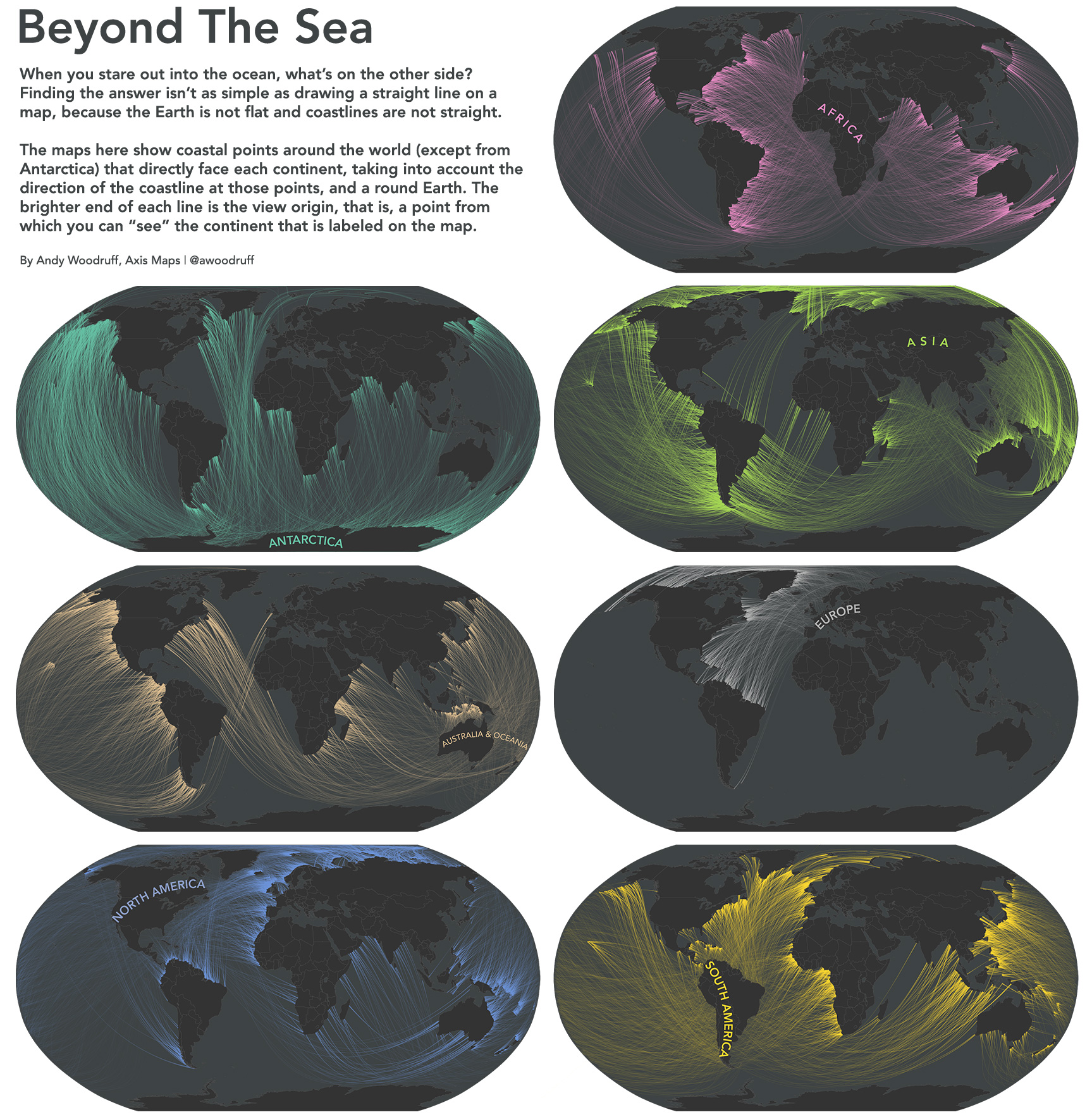
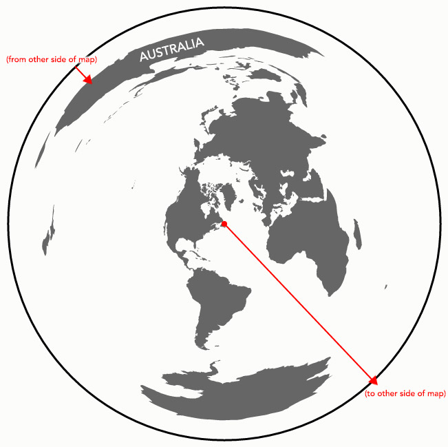
5. Beyond the Sea

Almost anyone who has ever gone to the beach has, at least once, wondered what piece of land or country lies over the horizon. To answer that question, the people at the Washington Post have come up with a series of maps that put different countries on different continents on the same latitude across the oceans. But cartographer Andy Woodruff wanted to go a step further. He argued that coastlines aren’t actually straight lines - they bend and curve in all directions. So, depending on where you are on the coast, and assuming that you’re perpendicular to the ocean, you could actually be facing faraway places, uninterrupted by other landmasses. For instance, if you were to stand on a piece of coast in Southern Australia, depending on your angle, you could be looking straight at the East Coast of the United States. Incredible, right?
Well, yes and no. Our constant exposure to the world map that we’re all familiar with makes it kinda difficult to come to terms with this, but it is true. The Earth, as we all know, or should, is a sphere, and the shortest way between two points on the planet is actually a great circle arc, not an actual straight line drawn on the map. Another misconception that comes from looking at flat, rectangular maps is that Earth doesn’t really have any edges, or ups and downs for that matter. The continents are also skewed in size and shape, depending on how far away they are from the equator. So, the next time you see Antarctica covering the entire bottom of the map, know that its actual size is close to Brazil’s. With that in mind, if you were on the coast in Newfoundland, you could look all along the Atlantic, around Antarctica and onto Australia’s southern coast.
4. Large Mammals With or Without Humans

It does seem kinda strange that Africa is the only continent in the world today that has large mammals, right? Okay, there are still bears and tigers on other continents, yes, but where are Europe’s equivalent to giraffes, or North America’s hippos, or Australia’s own type of rhino? The short answer is that they’re all gone. Now, of course these continents never had those species of animals in the first place, but there were once giant wombats, giant kangaroos, and large birds at least until humans made it to Australia. In Asia and Europe, cave bears, Irish elks, cave hyenas, and woolly rhinos were roaming the lands up until the end of the last ice age some 12,000 years ago. And let’s not forget America’s own giant sloths, car-sized armored herbivores, and the famed Saber-toothed tigers. What happened to them? Well, the answer is kinda obvious, isn’t it?
In case it’s not, let’s discuss it a bit. One reason could be climate change. After all, the planet was emerging from an ice age, and there were changes happening that could have affected some of the animals. But as Yadvinder Malhi, professor of ecosystem science at Oxford University said:
“Creatures like megatherium, the giant sloth, and the glyptodon, a car-sized species of armadillo, disappeared in North and South America about 10,000 years ago, when there were major changes to climates - which some scientists believe triggered their extinctions. However, it is also the case that tribes of modern humans were moving into these creatures’ territories at these times - and many of us believe it is too much of a coincidence that this happened just as these animals vanished. These creatures had endured millions of years of climate change before then, after all. However, this was the first time they had encountered humans.”
These maps show the current distribution of large mammals around the globe and their possible distribution if humans didn’t exist.
3. Ideological America

“The country has been arguing about a lot of fundamental things lately including state roles and individual liberty. In order to have any productive conversation on these issues you need to know where you come from. Once you know where you are coming from it will help move the conversation forward,” says Colin Woodard, an award winning journalist, who also conducted the research for this map. Illustrator Brian Stauffer is responsible for the creation of the actual map. Based on their research into ideology, Stauffer divided North America into 11 distinct nations.
One of them is Yankeedom and is comprised of the Northeast and the Great Lakes region. According to Woodard, the region put a “great emphasis on perfecting earthly civilization through social engineering, denial of self for the common good, and assimilation of outsiders.” Then there’s New Netherland, made up of the lands surrounding New York City. They are “materialistic, with a profound tolerance for ethnic and religious diversity and an unflinching commitment to the freedom of inquiry and conscience… It emerged as a center of publishing, trade, and finance, a magnet for immigrants, and a refuge for those persecuted by other regional culture.” Tidewater is made out of part of North Carolina, Maryland, Virginia, and Delaware. They started off as a feudal land that embraced slavery.
The Midlands are described by Woodard as “America’s Great Swing Region.” It’s an ethnic mosaic tied together by the “inherent goodness” of the Quakers. South of The Midlands we have Greater Appalachia. During the Revolutionary War, they shifted their alliances depending on who “appeared to be the greatest threat to their freedom.” The Deep South was made by slave lords from Barbados who styled their society based on the West Indies. New France has two separate areas. One is centered in New Orleans and the other is in Southeastern Canada (so, centered in French Quebec, obviously). These are quite liberal, and are a “blend of ancient régime northern French peasantry with the traditions and values of the aboriginal people.”
The region of El Norte is characterized as “a place apart” and heavily influenced by Hispanics. They value independence, hard work, and self-sufficiency. The Left Coast is a sort of combination of Yankeedom and Greater Appalachia. The Far West region is by far the largest, and was influenced mostly by the harsh environment, rather than by the ideology of the first settlers there. And lastly, the First Nation is inhabited by Native Americans that never truly relinquished their lands or old ways of life. Located so far north, it’s also the most sparsely populated.
2. Our Fair Share of Arctic Ice

It’s no surprise that the Arctic Ice is melting at an alarming rate. And it’s no surprise either that we’re all to blame for it. Now, when talking about air pollution, people are quick to point the finger at China - and with good cause, too. It’s the world’s leading polluter, after all. But there’s more to the story than that. China is also the leading producer of renewable sources of energy, particularly when it comes to solar panels. To date, China is spewing roughly twice as much CO2 into the air as the United States, but its population is more than four times as large. This means that on average, each US citizen is responsible for two times as much CO2 than an average person from China. But this doesn’t make the average American the most pollutant person, either. By looking at the CO2 emission per capita in every country, we see that China is at 6.52 tons of CO2 per person, while the US is at 17.62. Saudi Arabia and Australia are at 19.65 and 18.02 respectively. In India, every citizen is responsible for just 1.45 tons.
Now, what this map shows is the amount of arctic ice melt every person in the world is responsible for, based on the CO2 per capita in their respective country. Dirk Notz, a climate scientist at the Max Planck Institute for Meteorology in Germany has made the calculations to see how much carbon is needed in the air to melt the ice. And as it turns out, each ton of CO2 emissions translates to about 3 square meters, or about 32 square feet. Based on data from 2013, each US resident led to the melting of about 49 square meters (527 sq. feet) of ice in the Arctic. This map and these numbers shouldn’t be taken as a means to pass blame on others, but rather as a way to look at ourselves and what we can do to lower our own CO2 emissions. Air pollution, after all, doesn’t keep track of national borders, so we’re all in this together.
1. The Geological Map of Mars

Now, we can’t go through an entire list of maps about the modern world without addressing the Red Planet. Mars is, or will soon be part of the modern world, so we need to have it in here. People have been studying Mars and have been trying to guess its geology for the past 400 years. But it was only during the 1970s with the Mariner 9 and Viking programs that we were able to take a closer look. In more recent years, however, with the advent of high resolution cameras and sensors, astronomers were able to pinpoint with even greater accuracy the entire geology of the planet. An interesting feature visible even for those who have no idea at what they’re actually looking at is the fact that the Northern Hemisphere is basically one large depression - seen on the map in green. The crustal thickness here is approximated at a maximum of about 20 miles, whereas the southern part of the planet is at 36 miles.
Close to the equator on the Western Hemisphere, we can also see some of the most striking features the Red Planet has to offer. On the one hand, we have Olympus Mons, the tallest mountain in the entire solar system. It’s actually three times the size of Mount Everest, and covers an area roughly the size of Arizona. Close to it rise another three huge mountains, and all of them are shield volcanoes. This means that every time there’s an eruption, there’s no volcanic explosion, and the lava gently slides along their sides. We still don’t know whether these volcanoes are active or not. That’s probably for the future colonists to find out. Hope they have fun with that!
Another equally striking feature is the Valles Marineris. This is the largest canyon in the entire solar system and sits there like a huge scar on Mars’ face. To understand its immenseness, know that it stretches for 1,900 miles, is 500 miles wide, and 5 miles deep. The Grand Canyon, on the other hand, is 500 miles long, 18 miles wide, and one mile deep. Its creation still remains a mystery, but some speculate that it initially formed as a crack that got wider and wider as the planet cooled. Now, if you think that geological maps of Earth are important, you can only imagine how important this one will be for the people who will hopefully call Mars home one day.
Top image: Map of Earth at night. Credits: NASA.
No comments:
Post a Comment
Please adhere to proper blog etiquette when posting your comments. This blog owner will exercise his absolution discretion in allowing or rejecting any comments that are deemed seditious, defamatory, libelous, racist, vulgar, insulting, and other remarks that exhibit similar characteristics. If you insist on using anonymous comments, please write your name or other IDs at the end of your message.